© Marvel Comics LLC
Marvel Editorial offices—pretty cushy, right? One would think those comfy chairs, eager assistants, hot & cold running donuts and a free phone would be pretty nice, huh?
Well, me buckos, it’s not all pay vouchers and cheap hooch. Sometimes you have to gear up and just hang it out over the line. Doesn’t matter how many freelancers don’t make it back—there’s plenty more where they came from! Plenty!
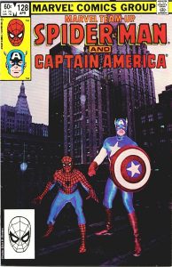
You see that cover? Two-fisted Tom DeFalco, Editor of Editors said in his low, menacing growl, “Brown, it is now time for a photo cover and I’ve got the two perfect subjects… Get your camera.”
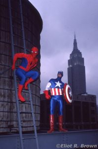
The Big idea: Marvel Team-Up. The book was a perennial chore to figure out which character was available and would not ruin said character’s main title. This point in time, it was Spider-Man teaming up with anyone we could figure out a not-too-wretched plot for. As Tom realized, shrewdly observing our only on-staff body builder, Jack Morelli was arguably the only person who could make that Marketing Dept. Spider-Man costume look good and Joe Jusko, again the only freelancer/man (yes, part freelancer, part man) who lifted weights, who could make that Marketing Dept. Captain America costume look good.
Pay no attention to the mustache on that man!
So Spidey and Cap were getting together to do something; who cares what. They still needed a cover. Tom thought it all up—we go right up to the roof and take pictures of the team against lower Manhattan’s finest buildings. Marvel had moved into a neat old building that used to be devoted to manufacturing (I recall during the time we moved in, having the rear elevator doors open on the wrong floor gave one the treat of seeing leather stamping machines for the belt industry!).
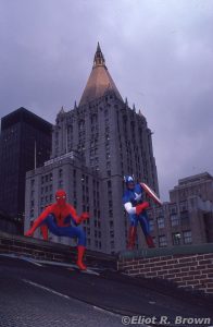
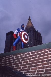
But the roof! The roof was new circa 1895, at my guess. A wonderland of highs and lows, even a Rosenwach water tower (yep, the name of the predominant company that specialized in redwood water tanks and whose silhouette make the NYC skyline so distinctive! That’s who made all that were seen in our comics as well—learn how to draw one, you’ve got them all!) And that view—to the north, a clear shot to half The Empire State Building. Right by us was the golden pyramid of the New York Life Building. A little to the south, the Met Life Tower.
[True Tales of Olde New York City: The Met Life insurance company wanted to have the tallest building in New York! They had the one building with the fancy beacon on top – finished in 1913. The decided to build a second, to be 100 (120?) stories tall! Back then, it was Met Life North Building, now Trophy Building. Alas, they started in 1927 and decided 40 stories was enough in 1929, when the Stock Market Crash took place. But if you ever find yourself on Madison Ave and 24th Street, check out the utterly massive pedestal bases meant to support a lot more steel and marble! That would have been something. Back in the 1980s, Marvelites could saunter over to Madison Square Park, have lunch or play frisbee in the sleek, Beaux Artes presence of that building-that-might-have-been! And all true original 60s TV Batman afficianados can see that building whenever Batman & Robin walk up the side of a building. The scenic backdrop used behind them is of that building!]
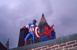
Back to more recent history! Tom, for all his excellence and mastery of comic creation, suffered the same lack as any other editor when it came to returning slides to the photographer. In truth, it wasn’t his fault—much of the blame can be shifted to the Manufacturing Liaisons, separators, engravers and publishers. They did not have a system in place to put such things where anyone would think to send them back to the office. I mention that particular failing of Tom’s in order to explain why I don’t have the original piece of film used to make the cover. As usual in most of these photo-cover explorations, I have nothing left but “discards” or “also rans.”
Which I present here with gusto!
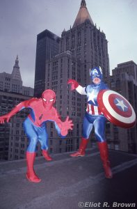
I love a cloudy day. Perfect for photography. But one also needs a little “kick” in the form of a flash unit. This should have been a snap but it wasn’t. The costume lines of Spidey were a little thin. The exposure I used was just a little slow. Slow enough to get a slight blur from those lines.
In the slide they chose, the lines were weak and Cover Man Ron Zalme thought they needed replacing. So what you’re seeing on Spidey is artwork. Normally, I would not object. This time, they could have listened to Old Doofy Brown and chosen a slightly over exposed slide. Y’see, dear friends, every time a photograph is copied it picks up a little more contrast. When a photograph starts as a positive image (you pick up the slide, hold it to a light, you see normal colors—very much what was there) it has to be turned into a negative and then back again during the printing process. This is a LOT of contrast. So the fine minds in charge of this picked a really neat exposure that was dead on—looked great!
But that’s not quite what you want. This was not a high fashion shoot where you will see something pretty close in print to what was in front of the camera. No; this was a coarse comic book cover. Printed on garbage. Admittedly, Ron worked his magic and brought back a lot of detail. Some detail a little heavier than others… But the image could have stood on its own.
Oops, that does look like Joe hit a banana peel. Any awkward poses you can blame DeFalco for– all of this was “directed” by him!
Here, those lines would have gained some black in the separations. Yeah, I know; grumble mumble…
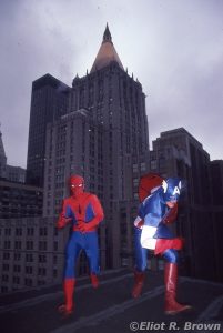
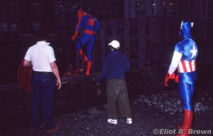
I must have been particularly poor this month. I only shot one roll of film. Which was expensive enough, thank you. There were only two “grab shots” and by the looks of this one, below, pretty grabby.
In this shot, we have Tom’s back to the left, his Assistant Editor at the time, Lance Tooks’ head over the side, Jack “Spider-Man” Morelli about to see that ladder, his then girlfriend Lisa Hachadoorian’s back and finally, Joe “Captain America” Jusko! This picture will give you an idea of some of the appeal of “reversal” film or “slide” film – the colors become super deep and rick when underexposed. Or, when you go too far: mud.
Below: when I scanned this slide I finally spotted that it was Tom up that ladder. He really did let it all hang out for his art!
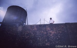
True Tales of Bullpenner’s Revenge: Jack, who was nearly perfect physical specimen and with really good reflexes—waited for Tom to be a certain distance away from him then walked on the “edge” of the building. Of course, he “slipped” over the edge to certain doom. That ‘doom’ being a built out ledge just a few feet down. He had to crouch to remain hidden.
Well, Tom’s infamously small heart swelled up about triple, Tom’s hair went from that slate black to shot-with-white instantly and a wail rose up (described alternately as a lion’s roar OR a bum’s charge) as he thought of all the paperwork he would have to fill out in Personnel.
When Tom saw that Jack was just fine and laughing at the sight of Tom’s saucer-eyes, Tom let loose with terrible curses, fit to the turn the air blue.
It was a good day.

I know that back then there would have been no way to afford this but it would have been pretty cool (AND insanely expensive) for the entire team to dress up as any one of the hundreds of superions that Marvel owned. What a photo THAT would have been! But this is good too. Ah just another untold tale in the annals of New York City.