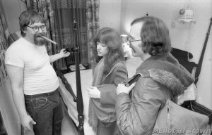
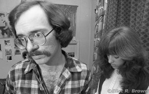
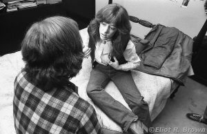
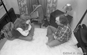
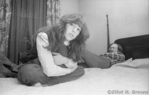
Only one person knew the weft and warp of this story: Dennis J. O’Neil. He actor-whispered his little troupe and I took pictures as his gentle whip crack said to.
So all this is Denny pure and simple, I am but a simple “narrow passage” of his creativity. From the look of the original boards that I have, Creator, Letterer, Paste-Up Artist, Production Man, Assistant-Editor-To-Be & Editor-To-Be Michael Higgins, put the boards together and lettered the story. But somewhere in there, I inserted my boot into the production line because I can see my own sweet handwriting alongside Mike’s precision Higgins Perfecta Regular.
It must be pointed out that comic printing is not kind to photographs. The biggest reason is the “dots per inch” that the books are printed at. 85 lines per inch. That’s bad, friends. Even the cover is only 130—and usually reserved for color. This is also only for the black & white books—regular comic interiors are 65 lines per inch (which partly explains the infamous Fumetti book!). And lets not forget the quality of paper at the time. It soaked up ink—“dot gain” is the slight increase in size of a printed dot as the ink spreads in the paper—that works in color’s favor, blending the colors. Not such a big favor for black ink.
With all that in mind, I may have stepped in trying to exert what little printing knowledge I had at the time. There was no good way to predict what the print run would end up like. There were no proofs to be examined while the printing presses waited patiently… We would throw the pictures under the process camera and begin duvening…
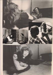
A little out of sequence here—sorry; this is what I’ve got. Here are the original prints “hot waxed” down to a huge piece of illustration board. We work at “1.5x up” and those boards have been a pain in the neck to haul around all creation, lo, these 40 years.
I still can’t remember if it was myself who made these prints. The top and bottom would be a bit larger (11” wide) than I would have the paper for (don’t get me started on dark rooms…) which suggests these were done outside. But whoever did it, used two types of paper. Which to me is odd (I know, if I did it, wouldn’t that have been less odd? It would have meant I scavenged whatever 11×14 paper was in the darkroom I invaded—still no memory popping up!).
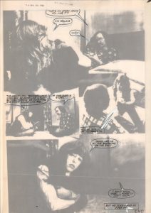
Here’s Mike’s lustrous lettering over a rough stat—this is on fancy-pants tracing paper, properly called Vellum. This helps the separators place the type where we want it.
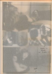
This was a holding line showing the separators where to work up to and add a black border. There was some dodgy sloppiness right at the edges. This was my handwriting. Interestingly, there are some black ink bits of retouching here and there that I would not have done. So I blame Mike!
©Disney/Marvel
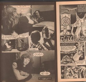
Lastly, here is the printed page. Interesting that in the last panel, Gruenwald is fading into the dusty fog of the background! Linda still looks great. And there’s also a glimpse of under-appreciated Creator/Artist Ned Sontagg’s work on the very next page. To read that, you’ll have to get a back ish, this is pushing the “scholarly review” clause of Fair Use Theory as is.
At this point in the story, we have turned the page on those grim exteriors to see our young lovers being shown their love nest/nexus of realities by Satan. In the guise of Writer-About-Town, Creator and Satan Impersonator Steve Skeates.
I would like to put aside the smarm for a sec here—Steve really has a touch of the boards in him. To wit:
Bone chilling.
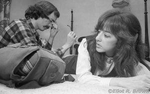
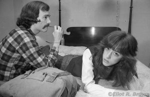
It is here that I must reveal to the world that this scene is set in my mother’s bedroom.
Yeah… Mom found this weird apartment on 56th St. to the west of Park Ave in 1974 or so. It had been someone’s fabulous NYC four-story building owned by one family. Some time later, made into a mix-up of small office units. Finally, by the time my mom and I got there, apartments. As it turned out, exactly across the street from the side entrance to 575 Madison Ave. That side entrance went past a messenger service, a parking garage ramp and into Marvel’s back freight elevator… which opened up right where the Marvel offices had a rear entrance. That was within yards of my stat room. I could pour a fresh cup of coffee and walk the commute to my office inside of two minutes. Tough on some days, I tell you.
Ladies and gentlemen, friends and neighbors—my mom’s four-poster bed.
We had jack-assed some of the furniture out and which is visible behind Steve. But you’d never know it. Though this is a rather sweet little hotel room for such a dive exterior.
Here’s an emotionally upheaving moment that I wish to ignore—take a look to the image left side of Mark’s head. That’s an elephant.
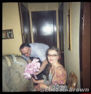
Why yes, for my mom’s 40th birthday, her long-time partner rented a baby elephant. No, really. Here’s a picture from that special celebration. Notice the giddy near-nirvana on my mom’s face. The elephant, a real sweetie named Mignon (French for “Little Thing”) was indeed housebroken (having been raised with the family that was hers) and could walk up stairs (more importantly walk down stairs—actually sitting and sliding!) And she loved birthday cake!
There were some 16 people in this microscopic Manhattan apartment. I present that as the only excuse to my not having some pictures of Mignon running around the block… Well, I thought they’d left and by the time I got downstairs, they had just returned to put her in her travel van. Also, this even took place some 3 years before I had that steady income and camera system that I wished.
The above sequence shows some storytelling points of view. I enjoy seeing the room from many different angles after all these years. I provide the page again at the end to allow comparison of what was printed versus what better versions of the pictures show.
My personal favorites in general because Linda has remarkable eyes! I am proud as a photographer to have caught them
©Disney/Marvel
I invite you all to find this story online and see it better as a complete story. It does have a strong theme of eternal love as a power through time. But don’t quote me.
