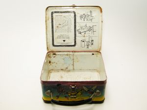
Well, sort’a—not like I can tell you how to make this wonder of 50s technology. All I can say is the experience of making battleships and tanks during World War II seems to have played an important part in shaping this ordinary lunchbox. The shaped metal used in the attach points of the handle—which I removed with no small amount of effort (AND returned!)—is clearly modeled after the pintle of a .50Cal machine gun… same metal, I’m here to tell you!
A few years back, I was in Orlando with the fam and we spotted a comic shop, in we went. I latched on to this midst the wonder and glories…
Even without the thermos and its clip– $30 was a steal. A little chewed around the edges, some interesting chemical erosions here and there—but what a beauty! (Did you know that if you dunk a lunchbox in Coca-Cola, it will dissolve? This looks like only a 15-minute dunk… )
And us kids were safe—reading these standard issue, illustrated instructions was a “must do” back in my day. Oh, not quite—this was merchandising from 1975. When I was a kid, we played on concrete and our “jungle gyms” were made of naked steel rods—some 20 feet in the air! What I saw in that store was a window back to the Bullpen of 1975. Through that window, one could see Marie Severin and John Romita Sr.’s handiwork. Because the year was right, I mostly thought an old colleague, Paty Cockrum, would have done most of this work. Alas, a quick check with her informed me I was wrong!
Most of the “pick up” art, with the attendant sizing and art corrections were produced by Tony Mortellaro. If I met Tony, I sure don’t remember. My time during his time was mostly spent on another floor at the Marvel offices at 575 Mad. But he was also known as a background inker for John Sr.
“Pick up” art—you see something that stands out and can be isolated from the background, you grab a photostat of it and presto! merchandising for decades to come! There were a lot of artists doing a lot of work but as far as merchandising cared, it was the characters that were being seen.
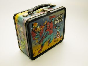
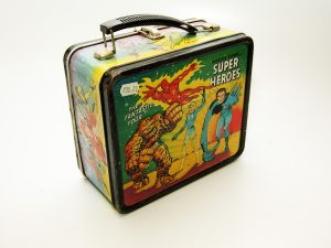
Let’s see what made the grade back in the day. The Alladin Industries lunchboxes were a big deal when I was a kid and they have only gotten more technically wondrous as time has moved on. For this article, the fact that they were the first to use characters on their product is what’s important. Marvel getting a lunchbox was a big deal and here’s just how much trouble they went to… to do it right!
Let us give thanks to mycomicshop.com who does very nice scanning work! And friends, when you need to balance grade with cost, mycomicshop.com is the place to go!
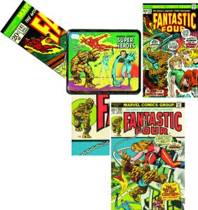
The Human Torch on FF 141 on the box front started out life as pencils and inks by John Romita Sr. Often it is hard to say where the corner box came from—usually they were done as separate pieces of art but used for quite a while. [Note: these are just random covers that use those cornerbox pieces of art! –inked-into-a-corner Brown] I’m saying Romita Sr. did it! FF 133 has the corner box done by John Buscema and looks like it was inked by him. Now what happened to the art at is transitioned to the lunchbox is someone—perhaps a couple of someones—thinned down or beefed up the inks.
Now I am sorry to speak ill of the long done art project, but man o’ man! Sue and Reed are just weak. Well, I am hoping Tony Mortellaro does not take offence and realizes this is not the work of his best day. And it might not be all him– I am guessing from the various twitches and dabs around the faces that this is a “many hands” pencil and ink jobbie!
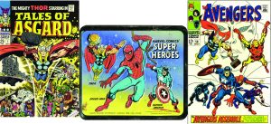
Thor! On Tales of Asgard #1, he is penciled by Jack Kirby. Inks by late, truly great Frank Giacoia with back grounds and such by Inker of Yore John Verpoorten. Quite a few lines were taken away and his visage less ominous… same for his cape, that had to fit the box! Cap! Well, Cap is also looking a lot happier than when he appeared on Avengers 58, also his shield is moved around, his fist unclenched and a lot less texture (known as “feathering”). This cover was penciled by John Buscema and inked by legendary George Tuska.
As for the Spidey pose—it looks solidly like Romita Sr. and maybe inked by him. But photostats could be “thin” and in need of an ink like here and there—plus a rope–? (Out of web-fluid…) But that rope looks like Marie Severin’s inking.
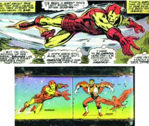
Old Iron Pants from Iron Man 73—pencils by one of the Greats, Keith Pollard, inks by Arvel Jones and Jim Mooney. Now why two inkers? Often an inker would do the “prime” work such as heads, faces or hands—and an “embellisher” would step in to do shapes, textures and backgrounds. For the lunchbox art, someone needed to take away a lot of line work—still guessing it was Tony Mortellaro! The Falcon and Redwing is by long-time great Frank Robbins, pencils and inks—but adjusted for the lunchbox by the usual suspect!
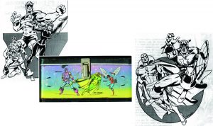
A Dave Cockrum two-fer! Straight from Dave’s pin-up work. Hawkeye and The Vision—note how much of Vision needed to be added for the lunchbox art! And the art “flopped” to face away from the Latch Of Death! I always found Dave had an ink line every bit as solid as John Romita’s! But it needed to be lightened up a little bit!
The Wasp is an unremarkable pose by John Buscema, pencils and inks.
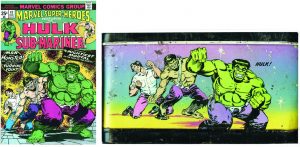
Here is an example of some severe re-working of a solid cover concept piece. Jim “Guardians of the Galaxy” Starlin, penciled and inked Marvel Super-Heroes 47. I’m pinning the tail on one Mr. Mortellaro for thoroughly rearranging and re-inking much of this art. Plus doing a rage-ectomy on Mr. Hulk… HULK GRIN!!!
And friends, when you’re looking for a quick comic fix or some deep-down info straight from the printing press’ mouth, swing over to marvel.com! You’ll be glad you did!
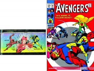
Avengers 59 provided Yellowjacket’s triumphant pose. Penciled by John Buscema, inked by George Klein (a highly regarded creator artist from the mid-Silver days). A few things did need to be moved around. Plus some coloring discrepancies… Dare Devil was penciled by lanky and well-coiffed creator Gil Kane, inks by the late Joltin’ Joe Sinnot Inker Extraordinaire. The Scarlet Witch is by Don Heck with inks by him but an assist from Marie Severin, here for the lunchbox.
Final details—who did the airbrushed background of the whole box? I don’t know—it could have been done over at Aladdin or possibly someone in the Bullpen did it.
A greater mystery to me is who did the lettering that identifies the characters? The Bullpen was a hodge-podge of artists and multi-talented people. Around this time Bob McLeod, much better known as a penciler/inker but got his beginning as a Production Worker! One has to start somewhere. But also starting around that time was late, ultra letterer Jim Novak—who may well have stepped in just as Bob was departing!
Some thanks: I can spot a lot of modern artists but not to the degree of Charles Barnett III, who is a good friend and (almost) neighbor (I wouldn’t want to walk it, but could) and a Marvel inker (a student of the late, indeed great Joe Sinnott!) who still works a mean brush (even though “retiring”). Also throwing in on my behalf, artist and convivial sprite, Paty Cockrum who solved the Riddle of the Bullpen timing. If Barnett has a discerning and accurate eye, my secret Olde Compadre—well in the shadows—sees all and knows much!
I thought an anaomy of a Lunch Box would begin and end with the milk thermos.