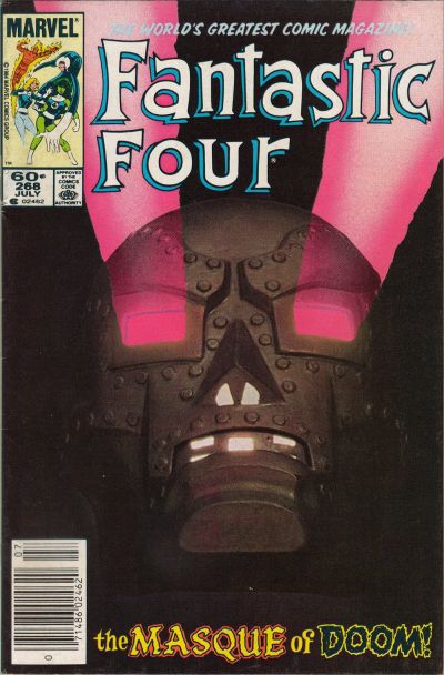
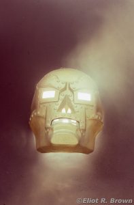
John Byrne. You know him, you love him. Needs no introduction by me. John was chest-deep in his run on Fantastic Four. Ticking along like a well-oiled salad—to quote my old comrade, Mike Carlin. Editor, Creator, Penciler, (sort’a) Inker, Writer Bob Budiansky—who oversaw the creating-machine that was John—saw the plot to this one and recalled the mask… Not “Masque” – that’s a sidelong reference to Poe’s “Masque of the Red Death.” [Don’t ask me; go accost John. I’m sure he’s addressed that in fandom somewhere. There’s no problem with getting John to talk… at length… about his work!—Eliot-chum-to-John-Byrne-the-Great!]
This is one of those books that shows John’s inventiveness. The idea of the Doom head piece being an assault device just shows John’s cleverness. The rest of the story introduces us to She-Hulk and is probably every bit as famous for that. We all know John’s history with that character!
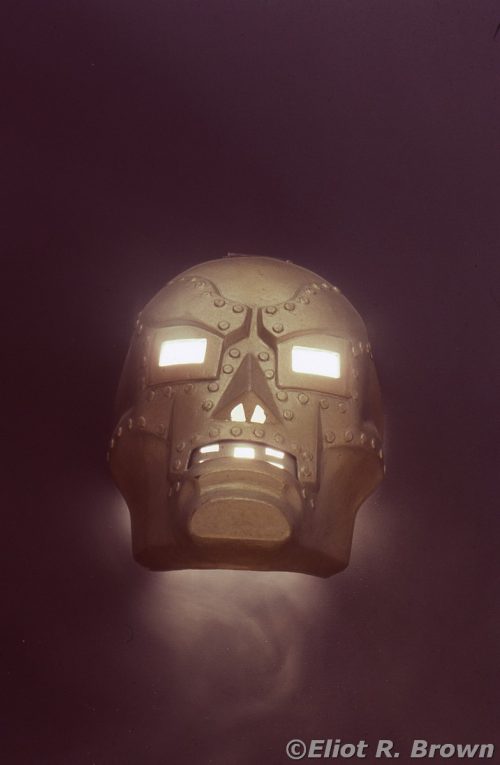
I keep going on about the “In-Store Marketing” program that Marvel had. Well, I don’t know what it did for the teeming masses yearning to see a real She-Hulk at a comic shop, but it kept me in photographic chips! The Doctor Doom costume was one of the better ones. I think they did away with the holster… But the chest piece and mask were terrific—I mean, that representation of that mechanical doohickey in the mouth is a dip of the standard to Jack Kirby, the designer. So good, that Bob thought to use that mask on this cover.
© Disney/Marvel
Bob and his Assistant Editor, Prior-Letterer-of-Yore-and-Lore Mike Higgins, laid it all out for me. The mask floating against a flat or neutral background and all lit up with beams coming from the eyes. I had not seen any artwork so I was off to figure that out.
I got a lot of that right but I failed on the eye-beams.
I zipped over to Charrette [architectural specialty supply shop of my youth; an exciting place much of the most interesting stuff was devoted to architectural models! Later it became known for art supplies but back in the day, it introduced 4×8-foot sheets of foam core! Architectur-El] which was super conveniently located just a few blocks north on Park Ave (where Marvel’s offices were). I hmmmed and mumbled about what color for the background, deciding on a sheet of Strathmore in rich plum —as this was coming out of my own pocket, that’s all they got! Then a few sheets of foam core, as I had a cunning plan…
The night of the shoot, I built a little box hanging between two piles of boxes in the big stat room. I can’t remember why I picked the stat room—must’ve been the greater ability to control room lights. The Bullpen was wall-to-wall ceiling lights. I also was happy enough to have my good friend Jack Morelli – Youthful Letterer in attendance. Also along was his moll, Paste-Up Production Freelancer, Lisa Hachedoorian.
I used the mask to cut a hole in the box and paper, then built a little lifter so that the mask was above the hole. Below, on the floor was a 500Watt incandescent bulb in a flood lamp. [Such bright lights were a photographic necessity when shooting portraiture. One needed to model the subject with light while they sat there. As a side note, one reason I hesitated to purchase so-called studio lights for taking portraits is because you need a system that used both “hot lights” and electronic flash lights in the same package. Very expensive back then. –Flash in the pan-El]
So here’s where my plan failed. The bulb on the floor was doing what I had hoped—sending a “beam” of some kind through the eye holes. The mask looked great, was all lit up with energies of unknown origin and terror… but, no eye beams.
My only defense is that it was really hard to tell how effective my film exposures where. Even so, I must’ve known the beam idea was not clicking. Because I called upon my secret weapon: Luke The Security Guard!
Luke—and I am endlessly sorry I never photographed him, nor retained his last name if I ever learned it—was a smoker. He came in to see what on earth was going on now and I asked him if he had his cigarettes on him.
He did—
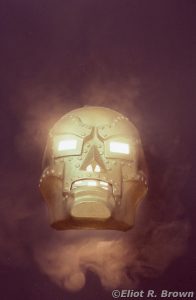
At this point, I’ve taken maybe 5-6 photos and I’m encouraging Luke to smoke more, blow out more smoke!!! I believe it was the above image where Luke was beginning to sway and grab for a table. He said, “I’m a little dizzy… “ and he did look a little green under his normal brown! [Kids! Don’t smoke!] and that was when I said, “Okay, one more!”
And this picture is pretty good. Now why on earth Bob “The Buddha” Budiansky decided to have Ron “Evil-Glowering-at-The-Sight-of-Brown” Zalme, Cover Production and perhaps by then, Art Director of the Bullpen—eliminate the background smoke, I do not know. I think it added a lot of additional technical décor, high energy physics and all that. I mean, c’mon, Doom had installed anti-gravity devices, obstacle detection and IR sensors plus beam blasters in this thing. The power source alone should have been smoking.
I am never one to question Ron’s decisions or abilities—I have, for example, seen his original art for the re-colored FF#1 cover that became a poster; a masterpiece of air-brushed primary layer coloring—but those sharp edges on the beams are still getting to me. I know! Take my 75 smackers and shut up. Fine.
What I should have done was borrow a friend’s slide projector. They throw a gradually spreading beam of light—if I backed off from the mask and bounced it up through a mirror, I might’ve gotten twin beams of light…
But that, my good comic chums, is now in the realm of “didn’t happen…”
