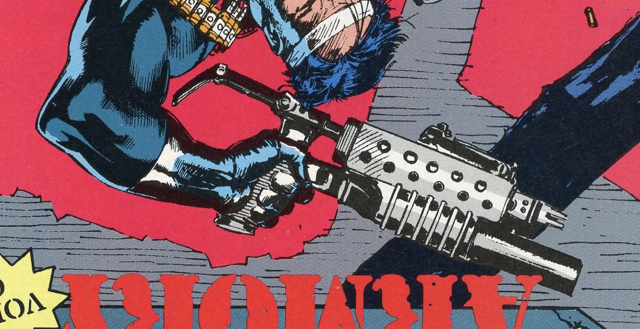
The First Cover to the Punisher Armory Series
The Punisher Armory. Put out by Marvel Comics. Hardly seems likely? No superheroes, no super powers. No stories, as we knew them; no panel-to-panel continuity. No page of small panels. Sort of a narrative that has only the character’s voice as the constant. Sometimes the technical guy (“Micro” Chip) threw in an entry. Mostly a gun on a table. As happy as I was with such a project I admit I found it strange. The Punisher was already one of Marvel’s most controversial characters. Not a “fantasy” doing veiled parallels to modern society—no; a kind’a real guy doing very human things right out of today’s headlines. And I was trying to make it even more real. But it was a good gig and going to be printed. Eventually, it would need a cover…
What to do? Covers are always hard—the fun kind of hard that Marvel thrived on. Back then, doing covers was the icing on the cake for the artist who did the interior. Except when the book was late, then having another person do it just saved time. Technically speaking the cover is slightly larger than an interior page and cover art rates were 120% of an artist’s page rate. So it was a good deal. That little extra bit of money was to encourage one to “go to town” on detail or execution of action. More than the usual design “oomph.”
Don Daley had been doing Punisher covers for months and months at that point. He was the Editor of the whole line, so he knew what went into a Punisher cover. Big booms, guns and screams—those were the elements of a good one. I had taken on the Armory as almost an “answer book” to the regular line of Pun titles. The character was giving comics a hard time; too violent, unrealistic, glorifying vigilantism, etc., etc. I was putting in a slower, more thoughtful Punisher. The man who has to train in order to be able to pick up any weapon, any time and deliver bone-blasting justice to—well, you know…
The first thing to note is that I asked, in advance, to have someone else do the Armory cover. At the time I did not know that there might be a second one and so was fairly modest in my expectations. But I also knew I was not the sort of artist to do something figurative or splashy enough for “sales” or “commercialism!”
I’m a big fan of that commercialism… And here it is, a nice big scan of the printed cover:
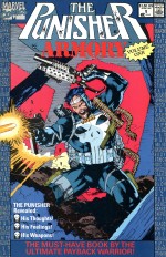 Don gave me that Puckish smile of his and agreed whole-heartedly. Of course he knew his business and my name never crossed his mind. When I learned that Jim Lee was to do the cover, I was delighted. At around the time this was all happening, sometime in late 1990, Jim was just revving up to getting tapped for the X-Men. Jim was a very talented young man and he was destined for greater and –ahem—great things.
[Okay, now Mr. Lee is a Vice President of Something Big and Important at DC Comics. I think this had something to do with their buying his comic company, Wildstorm. Then they gave him an office on the East Coast as well as another one on the West Coast—which must be tough on where to eat lunch… Of course, I am writing this in May of 2011 and everyone knows all of this—but back then… he was just really talented!]
So when I next got into the office and saw the cover, it was very splashy, comic-y, should sell, sell, sell and yet, that small nagging voice of envy made me say, “That’s not a gun.” I was referring to the gadget the Punisher is waving in his left hand, over his head. When I ran into Jim, I repeated that to him. He gave me that sad smile he reserves for fools-who-question-him and said, “I used reference; I’ll find it for you.” Well, he became a busy fellow and when I next saw him, he had made it to the highly-profitable party that was The X-Men and looked distinctly haggard. But I know when an artist is weak and I struck again—reminding him to dig up that reference. It did take a while, but he did it. That high-contrast photocopy is the pride of my reference collection—as it is a Jim Lee piece for me!
But the weapon in question is both Punisheresque and yet not very much so. At least not under the circumstances which that cover image is showing. I was right in claiming that that thing was not a gun—even though it looked like one. It is a 40mm grenade launcher. An M203, attached to the barrel and shroud of a Steyr. The M203 has its own grip. I found the same source that Jim used, which turns out to be:
 Guns of the Elite
By George Markham
Copyright 1987, George Markham
DAG Publications Ltd. UK
Distributed in the USA by Sterling Publishing Co., Inc.
387 Park Avenue South, NY, NY 10016
ISBN: 0-85368-866-4
[I include the American distributors because much to my amusement, they were housed in the same blasted building Marvel Comics was at the time this book was printed in the USA. If I’d known they were in the building, I would’ve spent more time dumpster diving… Marvel moved down to 28th Street, to the “Publishing District” in order to avoid the high prices of midtown in 1981. If I ever noticed Sterling in the building directory, it just never occurred to me to drop in.]
So, really good book and filled with interesting side-notes. Lots of pictures. The cover picture, for example, helped me to understand the very complex receiver assembly of the M16. Which, parenthetically, is where most M203s are attached to! That’s one on the cover.
Here’s the weapon on the cover in question, rotated so you can see it a little better:
And here is the reference image so kindly provided by Jim—except this is a spanking new scan from the book.
The above Austrian soldier, by the name of “Reisenhoffer,” is holding the weapon as it should be. The grenade launcher needs a steady hand and has a bit of kick. It also fires one big “bullet” at a time. This weapon does not fire bullets from cartridges, even though that is a Steyr AUG barrel. I am guessing that it is the shroud/fore grip that provides a nice set of under-slung rails to mount the M203 on and has sling hardware and a sight with which to aim the thing. There’s also a small butt stock that has the rest of the sling hardware. So it looks great, will do a good job blowing something up many meters away but is not the close-quarter rock-n-roll full-auto weapon that the Punisher I know uses…
And that’s why I criticized Jim’s choice. Which is in turn, why, no doubt, Mr. Lee has not called me in for a business lunch. I’ve got lots to say, Mr. Lee; all of it good!
Back to the cover! Cover production is a specialized art—brought to a high level of polish in the Marvel Bullpen of that time. Dawn Geiger was the woman in charge of all things covers. I will never forget her maiden name: Kumpf. She was married and dragged into comics by artist Steve Geiger. John Romita, Sr. was the Art Director in charge of it all; but especially art corrections. If, for example, a writer realizes that his long-winded soliloquy can be replaced by “Suddenly—“ then you have to remove the word balloon and replace the art left by the hole. In comes “Romita’s Raiders.” Tough, two-fisted pencilers and inkers, who played by the rules but knew when to break them. When John retired to greener pastures, into the vacuum stepped Steve Geiger. This rowdy bunch of free-thinkers found an even tougher guy to spar with—together, forged in adversity, they became: Geiger’s Counters. And count they did.
But in the meantime, Dawn had been working in the Bullpen as a paste-up and mechanical artist. Now what on earth is that, you might ask? A robot artist who works in paste? Well, if Dawn was a robot, I’m sure we all would like to be repair-people! But that term referred to the way artwork was prepared for the separators and eventual printing. Many pieces of artwork had to be dragged together and put where they belonged in a comic and made secure so that they would not fall apart on the trip to the printer. The ‘mechanical’ part is harder to figure out—my guess is that it’s from a time when you had to actually work with type and charts about type-faces in order to figure out exactly how to make type fit into a space. It may have come from the era of newspapers, when type was actually made out of molten lead in a gigantic machine operated by a typesetter. By the time I came along, “hot type” had lost and computerized “cold type” had won, changing the need for elaborate methods of figuring out how to stuff type into a certain space. But the description stuck.
Dawn came along and lent an air of sophistication to the position. She always dressed up and added a bit of class to the joint. So it was her and her people who put that first Armory cover together.
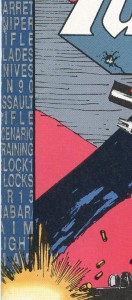
 Here’s why it looks so funny. See those two strips with type on either side? Well, there was an increasingly elaborate process of approvals that any book needed to go through to finally be “released” to the separators or printers. So when Barry Kaplan, Marvel’s Comptroller par excellance, and Steven Fox, flinty-eyed Legal Counsel, took one look at the original index of pages, they both did figurative standing somersaults of legal and accounting outrage! “Those are real guns?” they quaked. “Real manufacturers? –Of real guns,” they spluttered. “Yes, indeedy-doody,” –or something like that—was the reply from Don.
Well, it was a no-go! No way, no how! You cannot just put each manufacturer’s real name inside a Marvel comic. We can’t copyright them and we can’t ask for permission to use their names, products or imply endorsement or any such thing! Who was responsible for this?
“Brown,” was the quiet reply. “BROWN? ELIOT BROWN!!!???” shrieked Barry, beside himself, which made his shouting the work of a chorus. Barry and I were old colleagues, from the times when were both rising stars—of course, as Comptroller, whatever that was, he was paid much better. My star rose very high and fell very far, but not before Barry and I could share a cheap-jack sheet-rock wall between offices. The “normal” world of the 10th Floor at Marvel was chock-full of people and when I was promoted to Special Projects Editor (don’t ask), there was only room up in Heavenly Precincts of the 11th Floor. (Didn’t last long! I was back down in my stye before you could say, “Pull the trigger!”) There I was, back to back with an executive! Only a thin between me and he! I would often throw things at that wall, or fall over in my junky office chair against that wall (for comedic effect) and he would roar in, wondering about the building’s stability—or mine! We were close friends—well, close, because if that office wall had not been there, we would be only 4 feet apart and ‘friends’ in the sense that we were natural enemies. He was an accountant and I was an employee of a comic book company. Why Barry was in “sign-off” position, I do not know. The political workings of the rarefied “upstairs” will always be shrouded in mystery.
So when I asked Counselor Fox about the legal aspects of using such real-world resources as reference, he gave me his level-headed best measured response. At the toe of his jackboot. Off I went, better educated.
Don Daley, ever resourceful, had this unapproved book on his hands that needed to be “fixed.” By which I think Mr. Fox meant apply lighter fluid and a match. At this point—the book was stalled in un-released limbo—and the “Index Page” was gone. But Don, early to the concept of “thinking outside the box” simply took the advisement literally. We could not use the names of the product or the manufacturer in the index. That would call attention to our use of them. Their names were in the book, but that was essentially protected by First Amendment principles or Free Speech or something very important-sounding. And that’s how the cover got those strips of type on either side. That’s where the names of the products are—no manufacturers. By putting them on the cover, they were in the Public Domain—where anything goes! Or so I understand the concept. But on the cover, anyone could look at them—just as the product names are on display to the rest of the world when they are lined up in gun or knife shops. Or wherever.
Those two strips are the Index!. There was this nice Bullpen gal, Cindy Emmert, who I caught pasting down an Armory cover some time later in the run—who solved the mystery for me. She told me it was her who came up with that design. Cindy went on to design many of the covers of some of the mags of the day. The ‘Year in Review’ series, Marvel Age and many more. That’s why the type is stuffed in there– a little hard to read, I admit, but a nice design element, courtesy Don Daley, Dawn Geiger, Cindy Emmert and the Dynamic Duo, Barry Kaplan and Steven Fox.
Here’s a close up of some of the contents—that’s an early metallic effect, as rendered by the air-brush artists of the separators who worked on the regular comics’ covers—
 Cindy was also the designer who came up with distinctive “blueprint” look of the back cover (“fourth cover”). It was she who was tasked with coming up with a cover—one that didn’t involve any new artwork. The book had no ads and was a little more expensive than the usual 21 or 24-page comic. Ads help offset the art and editorial costs. Cindy took photocopies of most or all of the interior art and arranged it on a piece of cover artboard, then instructing the separators to make the black line art appear as white on a blue background. Genius!
Finally, the cover copy. I’m afraid I came up with the tag, “The Must-Have Book by the Ultimate Pay-Back Warrior.” The rest of the tags—“His Thoughts… His Feelings…” etc.– were anyone in the office that day, yelling out ideas. We were supposed to be making it look like a “Teen Beat” cover that got hit by “True Detective Stories” mag. A little ‘off’ but in a creepy way. I remember the plan was to come up with new ones for every cover. But that was it. No one could do any better and only the ‘Payback Warrior’ line stayed on. A little hysterical when said over and over, but Don was a sensation-monger after all…
Thus is all about the cover to The Punisher Armory #1.
