I am here to mourn a comrade. I didn’t know Jim very well; we were not close.
What I did know was that he was a big open, easy-loping-along chum. He was also the best letterer at Marvel in my opinion, and even in his office-mate’s opinion. Artist and Bullpen Letterer Rick Parker expressed that opinion too. I know; I’m going to hear it from Phil Felix, Jack Morelli, Janice Chiang and Mike Higgins—letterers all and all good, but I can’t rank my friends that easily (I count none of the DC letterers as even existing at this point!). In Jim’s case, I can.
The art of the letterer is arcane at best, deceptively simple. With the introduction of digital methods, it was mocked as “secretary’s” work (not to appear to denigrate those noble luminaries, I refer to the “work” here as the misunderstood implication of “data entry” via a keyboard).
Being able to see the page as the frame of a puzzle wherein readable words and making shapes that direct the eye (dialog “balloons” and balloon “stems”) must be located, is no small mystery of the human brain. Jim’s brain did all of that excellently.
Lettering can be summed up by likening it to making the “Perfect E.” And then doing it again and again, as Rick Parker, letterer extraordinaire has quipped, “Letterers are human typewriters.” And so they are. But no typewriter “knows” to move type up or down, squeeze this way or that or – in that ultimate catastrophe – re-write something to fit!
That ‘perfect E’ is like a pointilist’s point. You may look at one point and compare it to another. It is a point. Originator of the Pointilist Movement, Georges Seurat spent time making sure that point did its job perfectly. And so did Jim.
As I say, I didn’t know Jim. What I do know is that Jim was a successful freelance letterer up until Marvel went bankrupt. He continued to work but not at the “big houses.” The last thing listed on comic databases seems to be 2002. Now what was actually going on with Jim, I do not know. I know he got married and I offer my deepest condolences to all the Novak family. Even not having seen him for 26 years, I always thought I would. Comics is funny that way.
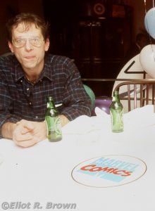
Marvel’s 1991 Office Christmas Party – held in January of 1992. Not sure why. Also not sure why Jim is pursing his lips! Edited out of the frame is Phil Felix and the late Hector Collazzo. Hec was definitely making a face and I may have been distracted by that to the point that I did not take a second shot. So we are stuck with Jim “biting a lemon.”
Here’s the scant skinny: Jim bounced out of home-town Chicago (according to Rick) right out of High School and right into the Marvel Bullpen. He wound up sitting alongside Rick Parker from some point in late 1975 and ultimately smelled the flowing milk-and-honey of the various joys of freelancing about 18-months later. Which, if you set his start date late in 75, puts his exit date in the middle of 1977. Or, as Rick Parker claims, early in 1978. So “a year and a half” (–Rick Parker) isn’t quite right either, more like two whole years.
It gets a little sketchy who did what exactly when—but Joe Albelo remembers replacing him. Mike Higgins thinks he replaced Jim. Joe remembers sitting in the Bullpen during that short period of time when it was Novak, Parker, Yomtov and Higgins. That probably reflects a time when Nel Yomtov got his own high-tone office and Novak was showing Joe the ropes.
So! That was about when both Joe Albelo and Mike Higgins came on staff, replacing him. Mike is no slouch himself when it comes to lettering and he was on-staff only a few months, perhaps half-a-year, when I joined the ranks of Marveldom.
Jim’s exploits concerning the working over of the Star Wars logo done for the comic adaptations and subsequently sent back up the pipeline to influence the movie logo (!) is the stuff of lore and legend. (The best account of it on a site by a big-time letterer can be found at kleinletters.com/Blog/) An interesting aspect of Jim’s work is his technical approach. Jim formed balloon outlines using templates. According to one of his protégés, Bill Oakley, that form of perfection caused everyone else to step up their game. Either using templates themselves or working on their lines.
Jim worked very efficiently. When the circumstances involved lettering on Vellum (tracing paper), he would apply guide lines on the opposite side. This way, he avoided using an eraser on the ink lettering side which always takes something away.
According to his old office comrade, Mike Higgins, “He didn’t like grain or resistance [in the page] – just the pure feel of the ink under his hand.” Which I think is rather poetical but then, Higgins is a mad poet.
The most inside comic history story I can relate is that Jim designed the logo for the MacRay Moving Company.
What the heck is that!!?? The MacRay Moving Company was a regional moving van company. A modest-sized one that had perhaps a dozen trucks. Also had a fine art moving division where a young Ralph (Marvel Assistant Editor back then) Macchio helped build custom shipping crates for paintings and statues! The “Mac” in MacRay refers to one Mr. Macchio, who is Ralph’s father. The “Ray” part was some of his business partner’s name. Thus, over a long period of time, if you ever saw a big truck or panel van in a traffic scene in a comic—it had a “MacRay” logo on it. (Shame on me for forgetting Mr. Macchio’s first name.)
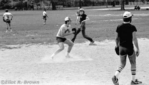
I am no baseball enthusiast, but even I could tell Jim was a very good player. The one game I extensively covered, in early 1980, has all the good shots of Jim that I have. This was a big game, Marvel versus DC– we had to reserve our field in Central Park—now, try to forgive me for not equally covering both sides. I was trying out a crappy telephoto lens I was still smarting from paying for. Four rolls of film plus my developing them—cost effective yes, but still a goodly sum for me. Besides, were there no shutterbugs over at DC?
Center: Jim Novak. To his right is British Department Editor and lathe-thin Danny Fingeroth. Immediately behind him is EPIC Mag Editor, Archie Goodwin. To image right is Marvel Licensing, Nel Yomtov.
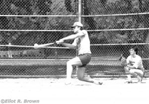
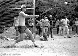
This is a poorly exposed image but one that captures the ball distorting on the tip of Jim’s bat. In that regard, I knew my shutter delay well.
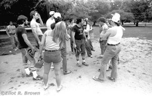
Mid-game strategy session. Team Captain and fellow stat-camera operator, the late Robbie Carosella is image center in a custom made black T-shirt. He is yelling at us all to reach down deep and find the win. Or something like that… Left to Right: Walking up, Creator John Romita Jr., Nel Yomtov, Jim Novak, Secretary Helen Katz in the forground, far to the rear is Editor in Chief, Jim Shooter, between Helen and Jim is Danny Fingeroth. Again, to the rear, is Intern Harry Eisenstein, Robbie, directly behind Robbie is Editorial Assistant Irene Vartanoff, to the rear is Creator and Agent Mike Friedrich. In the left of the pile to the right, is Creator Artist Bob Budiansky, deep to the rear is Archie Goodwin, way in front Production Worker Ken Feduniewicz, sandwiched between is an un-remembered Mail Room Worker (sorry! Reggie?) and the arm of Production Worker Joe Albelo.
Later in the game, Jim fires a bomb to deep center field. Under the bat is John Jr., standing to his right is Danny, hands on hips is the Mailroom fellow.
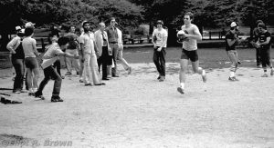
And Jim takes his victory lap! Dead center is Joe Albelo, Nel is clapping to the outfield and, at image right, Robbie is planning his next devastating calls. Production Worker, Ken Lopez extends his Low Five!
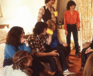
This was some kind of Christmas time get together in, of all places, The Plaza Hotel. Someone must have had a large freelance check, which I think was Nel Yomtov. Or The Plaza was going through a period of extreme hardship and throwing open its doors to anyone with some cash in hand. I think I remember an open cigar box near the door, which had a few tattered dollar bills in it. The slide frames (a little square of cardboard that holds some information and helps you avoid touching the piece of film that is the picture) are stamped “Dec 79.” I don’t remember this party very well.
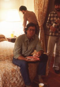
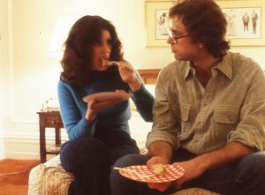
Here’s my bad series of pictures of Jim. I was using an antique Leica M2 with a “slow” 50mm lens. Now that’s a great camera but it was in the hands of quivering beginner. In my defense it was a “rangefinder” style of camera that made focusing under low light conditions difficult. So, to my regret, these pictures are “soft.” In the age of Photoshop I have done what I could to improve them. In the interest of showing another angle of Jim, I present them.
Here’s Jim yukking it up with food hanging out of his mouth.
And of course, no beautiful woman is completely undone until I stand before her with a handful of camera. “Eat up, m’beauty… you’re sure your fork is full? Good! >click<”
This is much of my photographic coverage of Jim Novak. There’s more in the baseball series but these are the best of him in relative close up. Alas, Jim did not get into the office much at all. Thus I took what I could.
I prefer to remember Jim through these images. He was as open and gregarious as these pictures might suggest. And a helluva comic letterer.
There wasn’t any letterer better than Jim. And he knew it. If he were here to read this, he would immediately say, “GASPAR!!” (Gaspar Saladino). As far as artists go, Jim liked Alex Toth and Drew Struzan. His favorite pen was an A-5 and he would prepare three or four of them at a time by making the word “JOHNSON” on a wet piece of wet-dry sandpaper. Then he would smooth them out by making tiny circles on wet glass. He loved the feel of his pen on paper and I rather doubt he would have been very happy doing computer lettering. Hand lettering was an art and Jim was an All-Star–on the field and in the bullpen. So great to see all of our old co-workers looking so young and full of hope for the future. Thank you, Eliot for sharing your memories with us. Those were good times.
When I was in art school (CCAD in da hooooooouse) I loved all of my classes equally (ok illustration was my favorite so sue me) except lettering. It baffled me. It frightened me. It frustrated the Hell out of me. So, to this very day, when I read about or meet a lettered I doff an invisible hat to their mostly unsung talent knowing first hand how difficult it was for me. Mr Novak I never met you but here I am doffing my invisible cap. Much respect.
Jim was one of those artists who outgrew his influences…he was so good he only influenced himself. His work was perfect–no mistakes. The only time a Novak job came into the Bullpen was for a late addition, or a change in the credits.He told me he had trained as a sign-painter before he got into comics, which gave him a different perspective on lettering, particularly on spacing for the titles and logos he was so good at. I definitely changed my approach to using templates after learning from him that he used French curves to form almost any balloon shape. So sorry to hear of his passing.
Jim was a pro. And a damn good softball player.