(*–With apologies to Cooke & Moore!)
Old comic office wags all know some of this but not all.
My time in comics straddled the old ways and the new. I was ushered out of the place just before “digital” and “paperless” became the watchwords. Those words in turn were just before the word “bankrupt.” After that unfortunate period of time ended true digital and paperless comic books were the norm. Why, the last job I did for Marvel (contributed to The Marvel Atlas) did not make use of vouchers! No vouchers… Ahem, I need a second to compose myself… so I apologize to my comrades old and new if I tell them stuff they already know. I hope the casual but curious reader of comics will find this interesting.
Sure, everyone knows what a comic book is… but how did it get that way?
The history of comics is well documented elsewhere. But to ‘hit the tops of the waves’ –
Newspaper moguls had all these daily comic strip printing plates just lying around. “I know!” said one smart cookie, “let’s just stack ‘em up in a book—no, booklet, like pancakes! Wrap this messy crap in something shiny (how shiny… very shiny) that won’t get ink on customer’s fingers and bang them through this… uh, what’s on the shop floor? Yes! This saddle binder stapler thing!”
Because newspaper strips can be printed so efficiently, they used them all in a matter of months! The need for fresh new and brilliant material was needed quickly! The time between Famous Funnies (1933) and Detective Comics/Action Comics (37/38) was not much.
And comic books were born.
I go back this far to bring up the idea that comic books were printed on newspaper presses. Even using newsprint—that special brand of high-wood-pulp paper that brings a tear to the eye of Soviet-era toilet paper users (but I kid my Russian buddies)! To round out this rambling, it was the use of high-speed printing presses and all the binders, trimmers and delivery systems you could want, that allowed millions of comics to be printed and shipped all over the country. (World Color Press—who for decades, printed ALL of them, was located in the center of the country (Illinois) so that travel times by truck to either coast was as fast as possible.)
Eastman Kodak developed the ultra-high contrast photographic film, Kodalith (1931 and is used here as a generic name for all sorts of variants), which made the production of steel plates used in printing much faster and maybe cheaper.
Okay, Brown, what’s that got to do with comic books? Printed color pictures of any kind was a pretty expensive and time consuming process. It was generally done photographically and was a technological high art. A monthly magazine could do it. A single issue from one editorial office. Yes, it could be bunched together with other magazines and from the same publisher, but the processes were much slower back in those days. A comic book company needed huge quantities of product to be gotten into the dime-dealing hands of their customers.
Color. Skipping over how they did color printing before Kodalithography (and the word “lith” or stone is in the name…) it was the need for a strong black line to neaten the blobs of color that made film production so successful. Also just a quick mention of the role of the “inker”—that wonderful person who lays down a neat dense line. So perfect that this particular film can’t “see” anything else— with Kodalith we are left with that black line.
When our loveable sheets of comic art are sent to the separators, they pass through an organizational masterpiece. Recall, the artwork is in an area of 10×15 inches. It must be shrunk down to “printed size” – which is generally 6 x 9 inches. This gives us a very crisp version of the artwork. Any smudges, footprints, food, cigarette ash and –by design—baby blue ink or pencil lines left by the artists, are eliminated by the Kodalith film. And it is a negative version on a piece of film— or plastic.
It was determined long, long ago that working at the printed size was more efficient than somehow working at the size of the artwork and shooting all of this mess down later. Consider: all you have is the ability to make a negative image on clear film (the “white” part, or the paper, is now see-through). When you make a copy of that negative, it comes out positive. We now have the ability to use the same materials to make working copies. In the end, we have a pretty black line image on clear plastic.
And NOW, patient readers, we are in the heart of Chemical Color Plate, Bridgeport, Connecticut!
I had the interesting—but now completely mysterious– assignment of traveling to the separators and the extreme pleasure of doing it with Sid Jacobson. Sid was a part of a rather daring (for Marvel!) experiment that Marvel ran, you may know it as the Star Comics line. In an effort to open up or bust in to the comics-for-kids market they hired Sid. Sid came from Harvey Comics, that whole enterprise having a strangle-hold on kid comics for decades.
I had my doubts that Marvel being able to do such a thing, not so much as anything having to do with Sid or the gang of wildly talented people he brought from Harvey. It was more about Marvel and its distribution. To get a little deeper here, the books that you see as you sidle up to the average supermarket cash register have a powerful, decades-long steel grip on those rack-slots. The entire country knows where to find its latest Archie Comic. I thought crowbarring into those slots was the only way. And I didn’t see Marvel doing it.
But, if it was possible, Sid, as Executive Editor and top dog (-aheh), could do it. So there Sid and I were, gently rocking our way by train up to Connecticut. I did not know Sid at all, having heard only a few tidbits of gossip. Alas, since it was a two-hour trip, both ways, I cannot really recall what we talked about. But Sid has been around the block and gabbing with some oafish 20-something was no bother to him. I fired off my one salvo of conversation-lull question about him writing a couple of Golden Oldie hit singles! (I urge you to find on YouTube Frankie Avalon’s A Girl Without A Boy! Then go buy a copy, so Sid can get some royalties.) I do remember him NOT telling me anything really interesting, no sordid tales of drinking shots off of June Christy’s belly or tickling the ivories in The Brill Building with Lieber & Stoller… nothing at all.

Whatever the conversation, it was rather pleasant and I remember having a good time. So that’s Sid on our trip to the separators!
Meanwhile back at the separators, we have shrunk down the artwork to the same size it will be printed at. Now here’s the magic of colorists and their color guides! Those unsung heroes of the industry provide a similarly shrunk down version on paper (used to be on stat paper, then a xerographic copy on paper) but it’s been colored on. The separators then take a blank sheet of clear plastic and place it over the color guide. Wherever there is, say, a pure blue they take this vile stuff called opaquing medium and paint little blobs on the plastic. If there’s blue sky here and there, they blob all that blue area in.
Of note is that everything is registered to the color guide. And by registered I mean a pair of holes is punched at the top. Also on the clear plastic and the black-on-clear piece of film. This way the “sky” blob fits in the black line area meant for it. For anyone familiar with animation studio’s “peg bars” this was similar if not exactly the same.
So here’s this dried-blood-colored blob in the shape of the sky. You can flip down the “black plate” copy to see that everything fits. All this is done on a “light table” where the entire surface is lit up from underneath.
The function of this blob is to be turned into a curved steel plate – one that now has a little raised up plateau in the shape of that blob. The steel plate is bolted to a gigantic and complex cylinder of steel that is…
The blue plate ink station! That little plateau will be hit with printers’ ink at 60mph and transferred to the newsprint. The roll is pressed between another roll—why not do both sides at once? – that has the long sheet of newsprint squashed between them. A blue-plate and paper sandwich.
I’m trying to paint a complete picture here without getting too bogged down in details. But that one color of “blue” is not the end of it. There are two more shades of blue, a 25% and 50% value, achieved by using a pattern of little dots. The friendly teacher part of me now suggests that you go look really closely at a printed comic book page, even a modern newspaper. You can easily see those dots, even when more than one set of color dots is printed on top of another.
What we have is three values of a single color—which adds to the massive organizational flow-chart of Chemical Color. Take that one step further, in which there are three colors! You see we now have 9 separate pieces of blobbed-on plastic to corral and the tenth piece of plastic has the black line art.
Hold on there, Brown! The New Math tells me there are only three colors and here you’re talking about 9 or 10? What the– !?
Those three values of each color is combined by the “process camera” wizards of Chemical Color to turn them into one piece of film. The full or 100% value, plus the 50% and 25% values are all “burned” into one. It’s even more elaborate than that (and yes, “black” is also a color! As I said, I’m trying to simplify here…) but all needs be said are: the three are made into one.
Now those single pieces of film for each “plate” – and here we’re talking about figurative plates (negative film)– are sent from Chemical Color to World Color, where they will be turned into large sheets of actual metal printing plates.
A technical aside here is that when many of us were young, the look of the books was really crisp. Super sharp lines, catching all the fine line work was because they used real steel for those printing plates. Then, couldn’t say when, a cost saving move was to go to aluminum plates. There was not much of a printed difference, but the metal was softer and couldn’t stand up to the beating thus fine lines got less so. In fact, both steel and aluminum plates are used up quickly and for most runs of comics, several plates are made as a matter of course.
Some time in the early 1980s, the ultimate move to save money was a move to a process called Flexigraphic. Some bastardization of rubber plates. This was a definite “bad time” for the look of the comics not just for the wiggly fine lines that resulted—at the same time they switched to bleached paper. What the hell is that!? Not entirely sure myself, but the paper was startlingly white and smooth. Probably they had to use recycled content and who knows what went into that bucket. Bleaching had the supposed happy benefit of making the books look cleaner maybe even better! (A hilarious digression of no import at all: During Marvel Universe days we learned that the name of our newsprint was “Baxter!” I know! Immediately we turned the Fantastic Four’s HQ – The Baxter Building – (all-knowing Stan surely knew…?) into an ex-newspaper printing building (Yes! Many newspapers had their printing presses right there in their office buildings! I used to walk home from the bus stop and pass the butt end of the presses facing the loading docks on East Side 43 St. Not sure which paper was operating then. But The New York Times and The Daily News all had presses in their buildings in Manhattan)! And if you’re still awake, the new, fancy-schmancy paper was named “Mando!”)
But those darned dots lay down a perfect little circle of color. Sigh… another super-techie detail is a thing called “dot gain.” When you put a dot of ink on a piece of paper, it bleeds into the paper just a little. The tiny dot is just a little bit larger. The good thing about that is when you are putting one color on top of another, you get a little nicer blended final color.
With the Flexigraphic plate laying down a perfect little dot on top of super-white slick paper—you got that dot and no gain about it! It was—still is—noticeable on flesh tones. Comic book white people are a 25% red on top of a 25% yellow. Now they were a screaming orange. Don’t ask about black people or Conan—that’s a whole ‘nother conversation.
I know, I know, I’m digressing too far. Okay, back to Chemical Color Plate.
Some day, the full story of why my sainted mother knew the man who was Manager of Chemical Color will be known. But today is not that day. Suffice to say we knew each other and this was my first meeting with him.
Eddie Whitbread (-Jr. who at age 82 sadly passed in 2007, had, just a few years prior to my visit, a kid! He and mom talked about that of course and I congratulated him on this visit. He said he thought he was crazy (for having a kid at 61)! But loved his kid…) had been there for decades, grinding out all manner of newspaper strips and comics probably from the mid-50s. Eddie knew me as Frances’ boy. We chatted and he told me a couple of very interesting things. At the beginning of comics as we know them, there were no “color guides.” No “colorists.” No one cared (I know this is not entirely accurate, Joe Simon claimed that he had delivered Captain America #1 to the office, “–artwork complete with color guide stats all rubber banded together.” –Plain Brown). Color was enough of a draw all by itself. There was a point in time, Eddie claimed, that publishers wished to have more artistic control than any unknown separator might have.
But that begged a question, which I posed to Eddie—who designed Superman’s iconic red and blue outfit? Back in 1938, it would have been someone at the separators! Well, lucky for DC, it was a heckuva good choice.
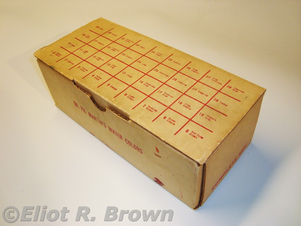
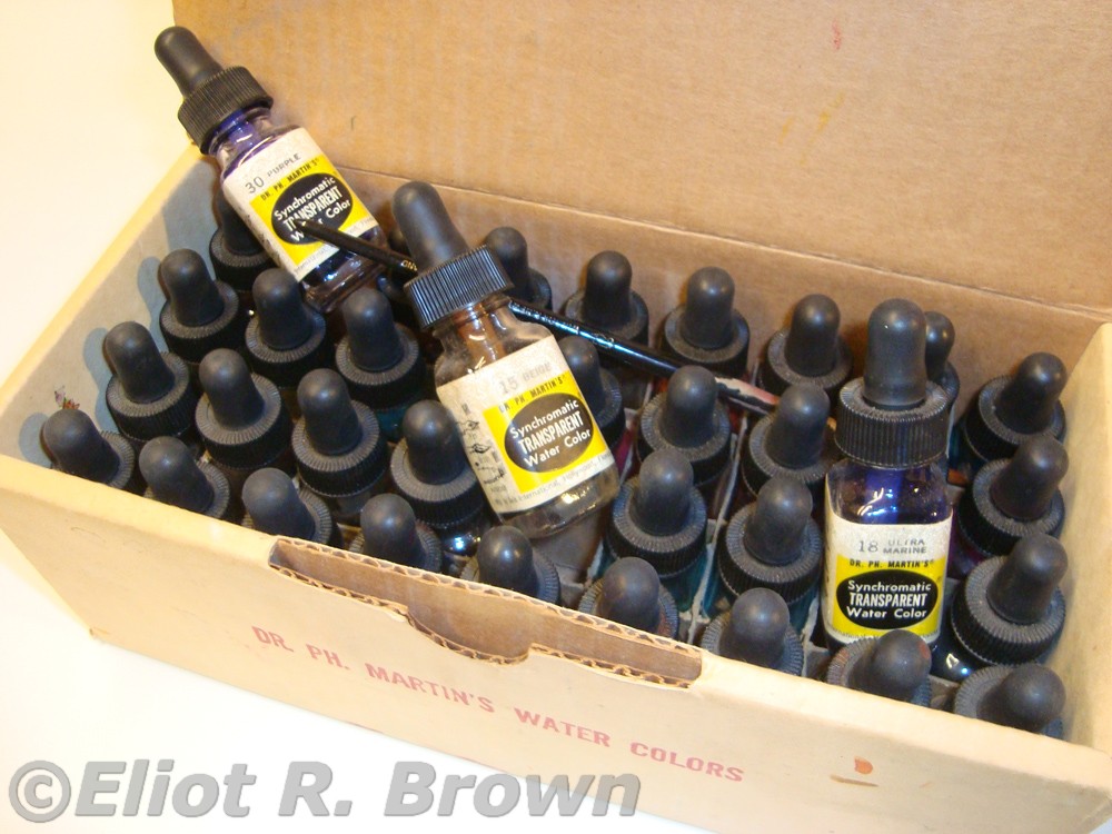
Eddie also mentioned that before any other coloring methods were used, it was the printer that provided raw, pure printing dyes to the offices! He made a gesture that indicated a quart sized container! Those had to be divided into smaller vessels at the office. In the 60s through 90s, the standard was a wonderful and convenient organizer of Dr. PH Martin’s watercolor dyes—already mostly broken down into handy “standard” colors for you. There were several alternate materials—really any color could be used, as one was really demarking an area. But it was nice if it was close. For example, ultra convenient magic markers were quite common. One was much better off marking up that color guide with the special color notations, so there was no uncertainty. Yet another antiquated method, stacked up next to the Edison Cylinders and buggy whips.
Shame-faced admission: this paucity of photos is a clear example of mental breakdown. I knew I had unusual pictures. No one had ever mentioned they’d, a)been to Chemical or, b)took pictures! What I did do was to take the set of prints and Scotch Tape them up to one of the glass walls in Editorial, probably Tom’s and my office. I had some kind of sign saying, Look On In Wonder. And then… what… ? Prints long gone. At one point, I assumed the negs were gone. Then, after several moves upstate, I found this single strip of negative film at the bottom of pile of junk from one of my old offices. How on earth could I have misplaced and now apparently lost forever, these images? (Too much rubber cement thinner. –Vaporous Brown)
I probably had pictures of Sid, certainly of Eddie, maybe even me taken during that trip… But for now:
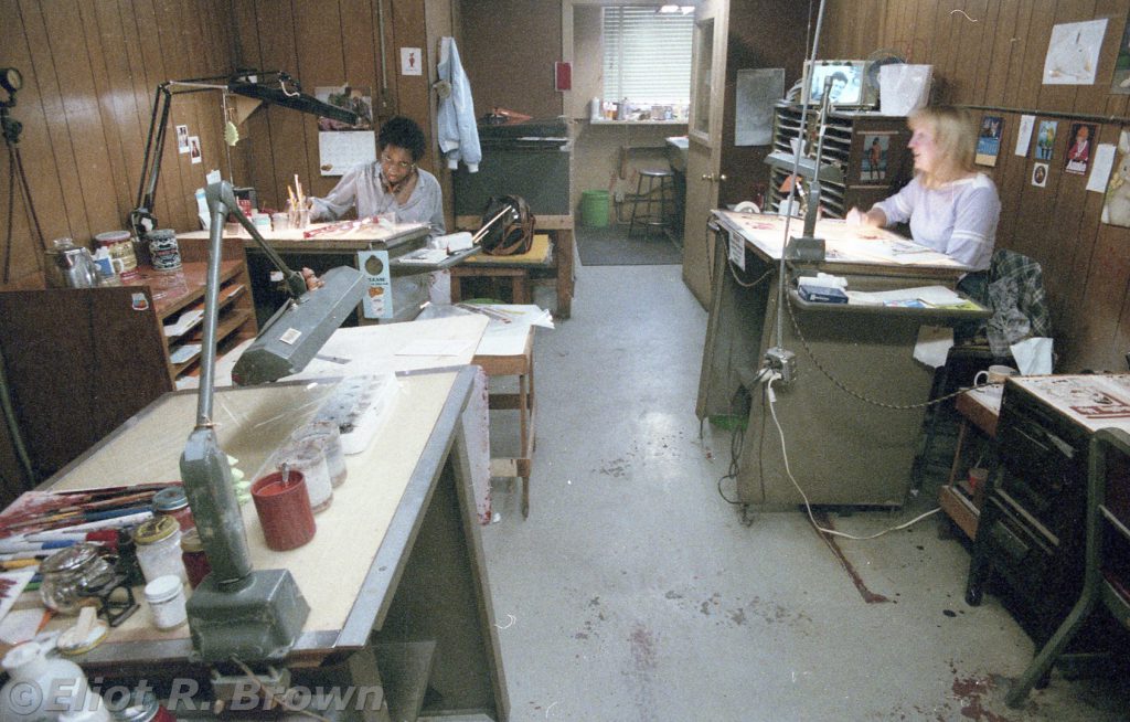
The “full color” potential of the cover was realized by the fact that the covers were printed at a higher resolution than the interiors were. “120 lines per inch” for the cover and 60 lines per inch for the interiors.
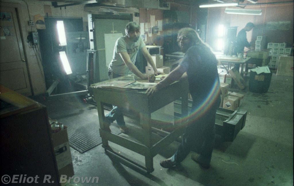
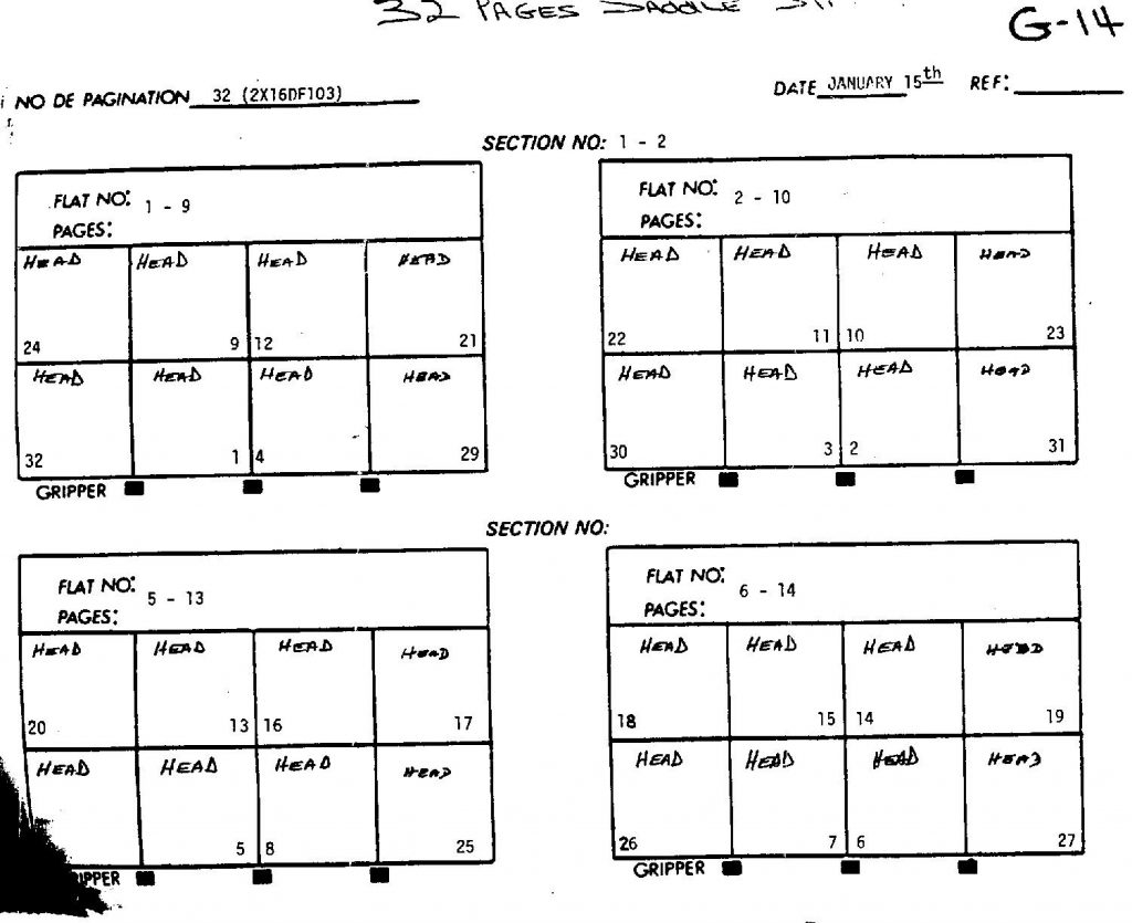
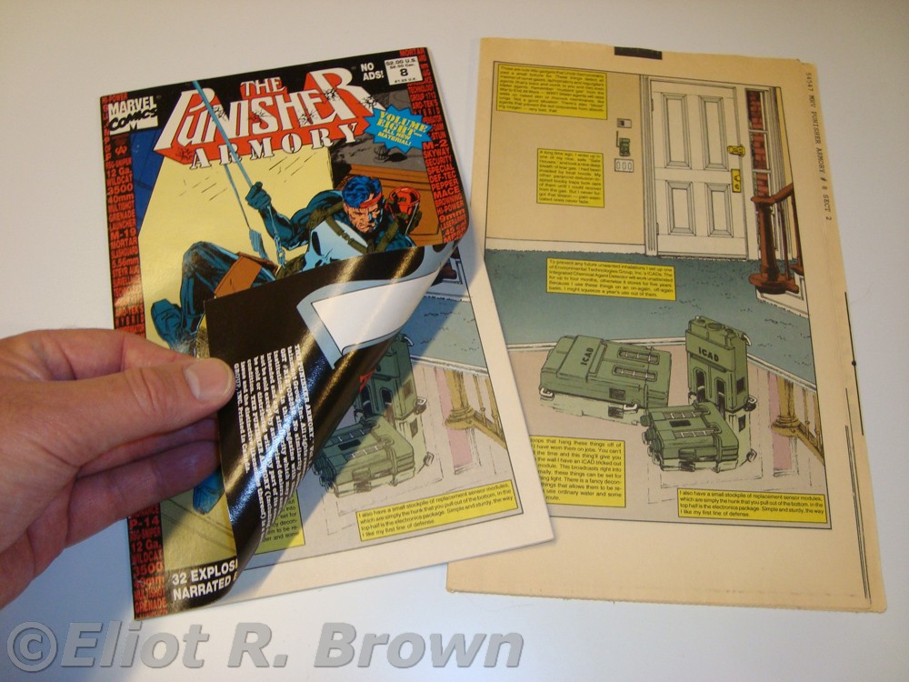
Here is a little show & tell. All 4 double-sided sheets for one book are stacked up, face to face. Then the stack is folded once one way, then folded the other where it is wrapped in the shiny cover and stapled then trimmed to size. I’m not sure if this can be explained with the stuff I have on hand—but that never stopped me before.
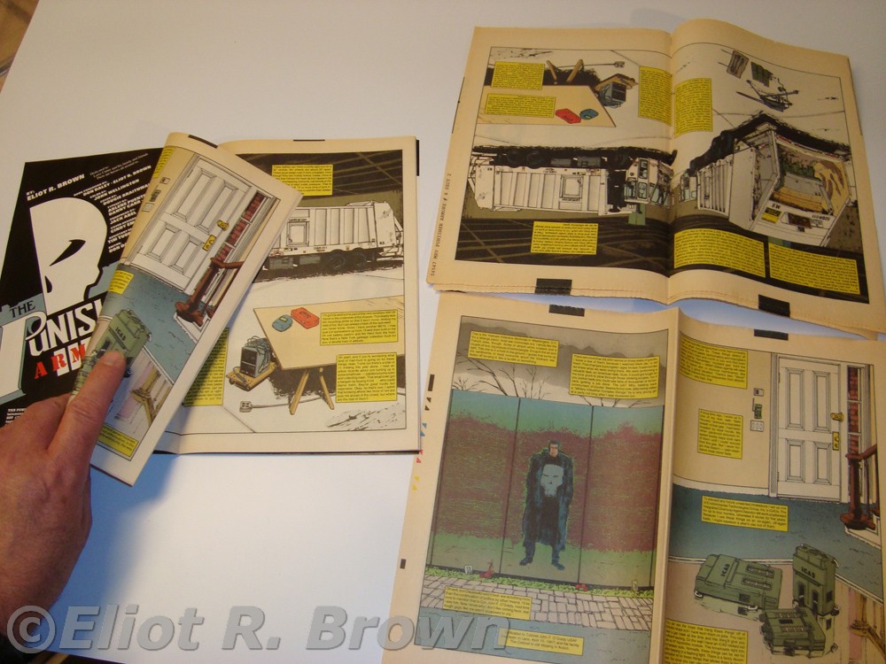
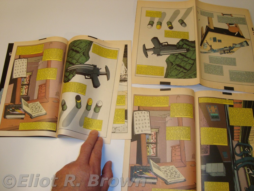
Yes, we all are confused! Keep the pile in one piece as you poke around and you can imagine, coming up with this the first time was straightforward, but dealing with it over the decades can still be confusing. I only wish I had one of the 4-up “silver prints” so as to show this off better. The silver prints were copies of all the negative flats on very cheap photographic paper. They were really supposed to be used to check the resulting page placement and perhaps figure out if corrections could be made in the event of a page being placed improperly. They proved their worth because they are the source of artwork for reprints now and forever!
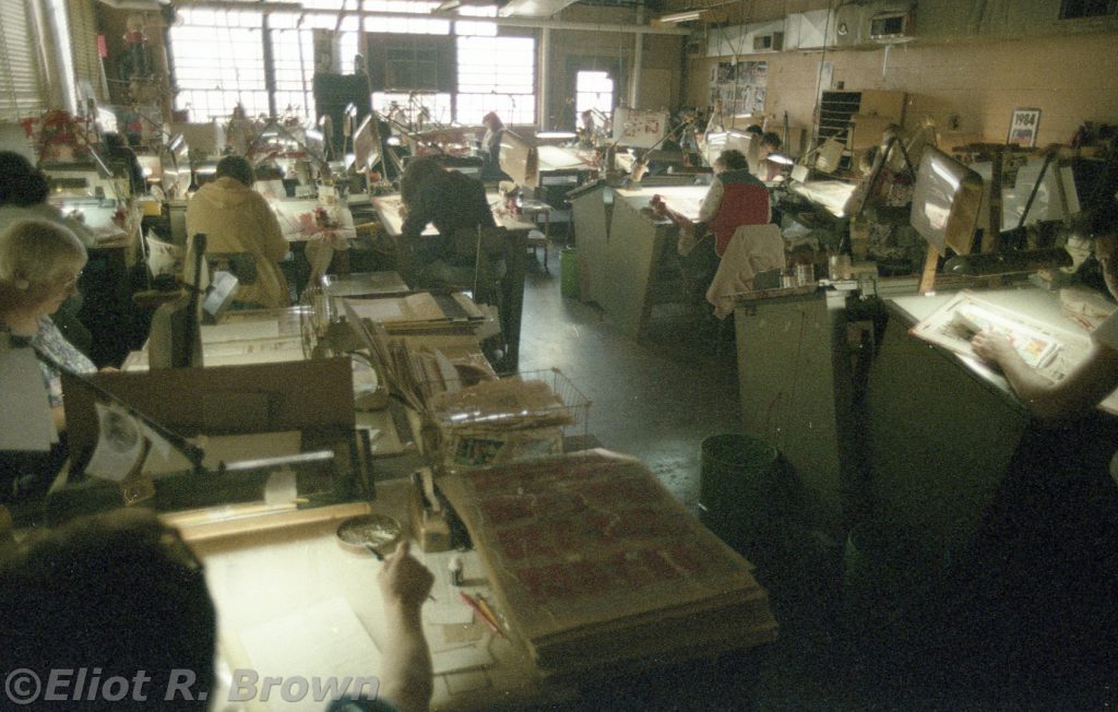
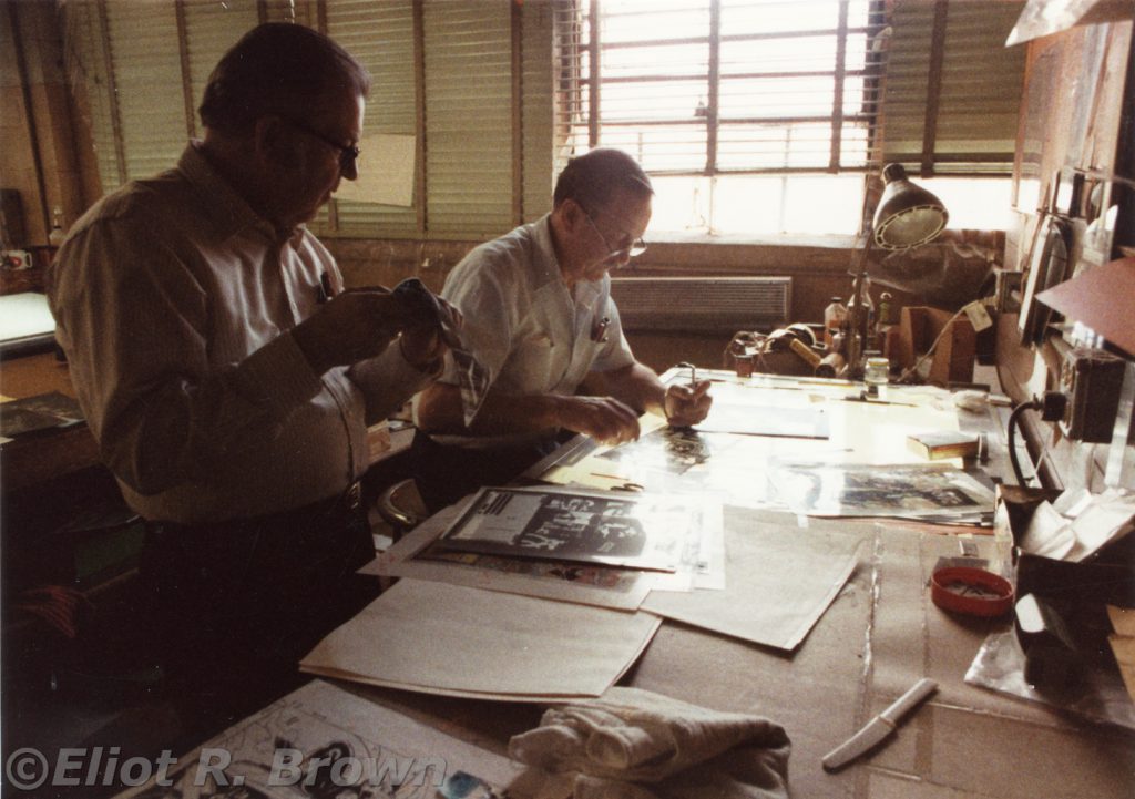
Eddie told me that this was all “piece work.” Everyone was paid by the piece. You could walk in the door with no experience and, if your fine motor control allowed you to keep the opaquing medium within the lines—you were in! For a day or a decade. As Eddie put it, a week ago, some of these people were bundle boys at the local super market. Delivery boys were put on tables and didn’t leave for years. A mom pushed her baby carriage by the place and someone asked if she could step in! She apparently could do good work, kid and all!
Once again, I recommend you turn to a printed comic. Take a look at the coloring. See how it comes right up to the line? Or, goes right over the line. Some of this may be due to the actual printing press being a little off, but more often it was a separator needing to finish 10 pieces in one day. Recall there is a separator’s sandwich of the color guide, the clear plastic with the black line art and then the clean piece of plastic on top. The artist-worker would paint, let’s say our familiar blue sky, up to the line of the artwork. The real job can be a little more complicated by other colors on the page. Some of the colors are mixes of all three primary colors and so, thus the same shape must be painted three times. Exacting work if a little tedious at times. Keeping track of all this stuff was probably most of the on-the-job training!
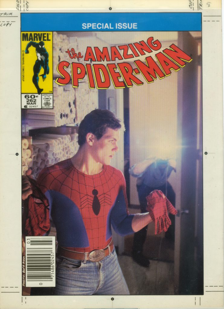
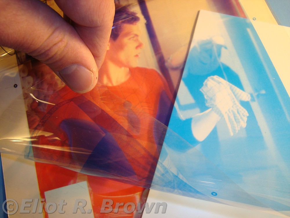
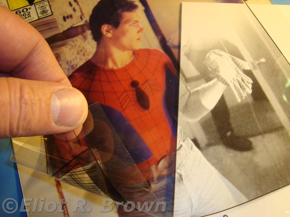
When a cover is made, they are generally considered the most important parts of the comic as a sales tool. Remember, there are “four” covers in a comic book! Yes, I mean it. We are well acquainted with the front and back covers, but the insides of the shiny paper are considered covers too. And, most importantly, they are paid for by the advertisers! The need for some kind of checking copy of each cover was so important, a whole system of color proofing was invented by 3M (Minnesota, Mining & Manufacturing Co.)! You could take the film negative of each color that was to be used to make the steel printing plates and get a correct color version on clear plastic. Stack them up and you had a pretty nice version of what might print some day. Nobody remembered the real name, “Chromelin” (since I never saw it spelled, this is my sound-alike –Chrome Dome Brown) so one of those things was generally called a “3M.”
All of the above is to help any casual reader of comics to better appreciate the finely tuned machine that lay beneath the surface. Even deeper than editorial! Once we in the office got rid of the book, we didn’t need to give it another thought. This amazing process was poised to dash the book through the system. Before we knew it, we held a printed book in our hands. Almost at the same instant as anyone else in the country held it in their hands!
A Fun Fact is that at some point when comic sales were sinking—in the late 1950s, I think— Chemical Color Plate OWNED Marvel Comics! The amount of money they were owed got so large, Marvel just signed the place over to them! (I think it was Cadence Communications who bought Marvel off of them in the mid-70s. – Recollectin’ Brown)
Finally, since “deadline” became an invocation, threat, description and finally death knell of comics—the necessity of using digital separation in order to make use of the largest number of separators in the Northern Hemisphere has most likely meant the great reduction in use of Chemical Color Plate. It is hard to tell if it is still in business in a form that comic book people would recognize.
But for one helluva long time, that joint was jumpin’!
Thanks Eliot! I never knew the process of producing the comic book after the coloring.
Thanks for the trip back to days of yore. It was a much more tactile time! I did paste up at a local newspaper in the 80’s. Lots of fumes and melted wax!
Eliot, thanks a million for writing this! I’m glad you were able to preserve a piece of this obscure history. As someone with extensive printing and pre-press experience, I really appreciate that you took the time to write all this. I feel that the 70s era comics were printed quite badly, and comparing them to the comics of 1960s, I can see the lower quality.
Awesome article, Eliot. I had never hear about Chemical “owning” Marvel. (Did they “own” the rest of Magazine Management, too?) Has this ever been written about elsewhere?
Very Kool article::::::::Living in Germany now,,,I am an ”ORIGINAL” Chemical Color Plate Color Seperator. Don’t mind saying :::Lauren Kent ,,,Phyllis and Helen heads of the Department called me ”KENT” because there were too many Lauras and Loris..I was in the era of Dan Coran ..and on… Chief great guy,,,in the late 70’s . He passed way to Young, he was the most loveable boss I ever had. Well….it’s just past The New Year 2019 so cheers:::proßt:::to all my Wonderful fellow Color seperators and photo makers from the Good Ol Days. Funny we have in my City a Comic Shop,,,,,no Comics, just parafanalia (sp?) and I have made my self and Chemical Color Plate well known there. Love ”KENT”
Sorry to take so long to reply– this website needed some working over! Thanks very much for keeping the Chemical Color Plate legend alive and international! I found it to be a very interesting place. So much hand work had beaten every difficult angle and corner down smooth. The work was smoooothly done! Thanks, Kent!
Can you tell me when the picture of the room with all the people at the light box desks was taken? I used to work at CCC in the 70s and think I recognize myself in that picture!
This trip to the separators would be late-1984 or early-1985. I hope you do spot yourself! Make sure to let us all know back here. I was fascinated by this corner of the whole mad river of comic work. I really wish I’d taken more pictures. It feels like a balancing act to me– I am more comfortable if I know someone or the whole place. I don’t want to seem like I’m taking pictures of the strange! But I have to be content with what I’ve got. There are so many people involved in any one comic page, it really boggles the mind. That’s one of my goals is to introduce people to all the behind-the-scenes stuff. I mean, I love John Byrne, but there’s a dozen people standing behind him on the way to the comic shop!
Thanks!
If that was taken in the 80s, it definitely wasn’t me. I left sometime in the mid-70s. What’s weird is that not only is the person sitting in what was my seat dressed as I would have been (dark long-sleeved shirt and jeans), they also have dark hair as I did then. And when I challenged my husband to guess the person who might be me was, he pointed right to that person. Wonder if it was the doppelganger I once saw in my town? She even had the same car! Thanks for this article, btw. I was sad to hear that Eddie is gone, but the pics brought back memories.
Thank you, for contributing to the history! I found a folder that had the year “1983” on it. Yeah, Eddie was a big sweetheart.
I worked at Chemical Color Plate from 1971 until it closed in 1989. As a matter of fact I am the blond on the right in the cover dept photo.I still have many pieces of my color separations and 3m proofs. After CCP closed I was a freelance colorist for Marvel Comics for three years.I see a comment above from a Lauren Kent and I remember her.