In my childhood, The Fantastic Four was “it” as far as I was concerned. With Spider-Man running a close second. The Baxter Building was as real as Marvel’s super-heroes got. In fact, the early version, as drawn by Jack Kirby, was very close to a real building! Just a few avenues away The Colgate Building was visible through Stan’s office window (which I could look through when a young, scrappy delivery boy!). It was a modest design and had yellow inter-floor panels. [I THINK it was The Colgate Building—I tried finding it in picture references keyed to that decade and could not. But that particular city block was not pictured by the authors, darnit. But my memory tells me it was there. Plus Jack was famous for using things around him as page elements. – Uncertain Brown]
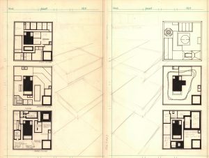
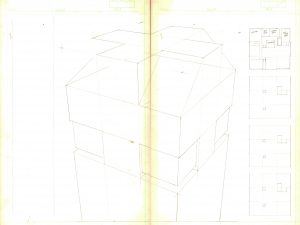
Needless to say, when my early employment at Marvel arose (roughly mid-1974-75), I picked up some sheets of art board and started laying out floor plans. Using some of the fabulous high quality sheets was an office prerogative. I saw the top floors of the Baxter Building filled with every branch of science I could think of.
I got pretty far. I showed my rough version to chum Irene Vartanof, she of office correspondence and Editorial chores, who recommended I take it straightaway to the Editor of the FF book! Jim Salicrup. Jim was a pleasant fellow and I thought nothing of bringing the idea to him. Jim did not see the potential there and passed on the project.
One wonders at certain points in history. Where would I have been if Jim Salicrup had started me on my technical drawing life and not Mark Gruenwald?
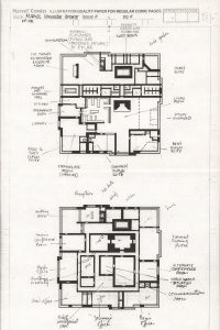
You can see much of the concept work and layout ideas that would follow me down the decades. I would also quickly run out of room if adding legends. Those small descriptors of what’s what.
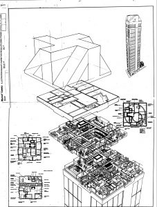
I spent a lot of time chewing over the innards of the Baxter Building. I had done some quick versions for the Marvel Universe endeavor. Then came the “deluxe” edition—
Basically, with the floor plans all figured out, moving on to what I considered a nice showpiece, would be easy! The 30th Anniversary of The FF was coming up. Issue #358. I had two months to get crackin’!
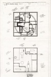
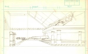
Dear readers, I am sparing you all the drawings I did of many of the rooms. I am just showing this one. I was trying to “see” the labs, the offices—even the kitchens! Above is the ground floor of the newly christened Four Freedoms Tower. Someone had destroyed the old building and a brand new one was put up in monthly periodical time! Public amenities, vendors and concessions filled the grounds of my design. I was heavily influenced by the fairly new Citicorp Tower over on 54th Street which had a vast open atrium that rose 10 stories before the building started!
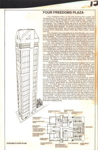
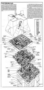
Here is the unused first rendering. Apparently John Byrne, the then current Writer, Penciler, Inker, Letterer and Colorist of the then current Fantastic Four comic, thought it was too close to something he had planned on using. So this design was given the heave ho. The design below was deemed acceptable by the great, over-heated and shiny brain of Mr. Byrne. Who would proceed to blow it up only a few issues hence anyway.
Editor and Karate Kid, Ralph Macchio was tapping his toes impatiently. I would see him idly pointing the calendar that contained a: “Deadline That Could Not Be Broken.” Then also idly tracing a line across his throat with a thumbnail… [And friends, never, ever give a freelancer the real due date. It only confuses them. Ralph was treating me as an adult, which never ends well. –Will Work For Toys Brown]
I was adding ideas and possibly working on drawings that had been started years prior. Maybe Ralph would give me an extra page for these concept drawings– ? Nope—I had a two-page spread and that was that.
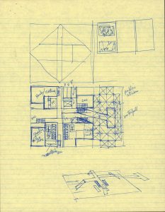
In the meantime, I neatened up a bunch of sketches…
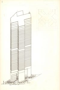
I spent some time trying to figure out what the best viewing angle was—here’s one I nearly brought to “job-start” status—
Alas, the past repeated itself and I would not have been able to place the legends. And the viewing angle of the perspective was not quite right.
Around then I realized I had begun something fairly stupid. The above drawing is like that roller-coaster ride—the part of the ride where you are inching up that incline to “bad ride downhill…” I thought, well, I’ll just open up a couple of walls and show an office or two, maybe an electron microscope or a table-top atom smasher… something small…
The next step, that I did not get into the office in order to make a copy, was where I realized… I was going to draw every room. And put stuff into it.
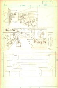
Okay… fine… I set up my perspective drawing gimmicks (– which I realize I should do a separate page on) and got started. I penciled, on and off for two weeks. That deadline was starting to cast shadows.
I did manage to get into the office to put together this, in order to see if it worked or not… It didn’t.
The page had not been designed to show the floor layouts and the pictorial representations of same. Ah well. Onward.
For seven straight, 10-hour days, I inked this monster. And I was still not finished. To my shame, the upper-most hanger floor is essentially empty. The page needed to be handed to the Bullpen and worked on. I did do the legend placement. But the text is all Bullpen paste-ups.
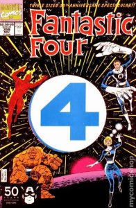
Alas! I no longer have the original two-page spread. Which was lost to mis-adventure. This electro-photostatic copy is all that I have. This 30th Anniversary offering hit the age of die-cut “special” covers. And so, there was a second cover, on top of the first, made of sturdy shirt cardboard, with a hole almost the width of the cover. One could hang this book on a door knob. It also weakened the cover to the point where one could as easily open the book as tear that cover clean in half.
(And friends, when looking for the best in best-price for the best-grading, look no further than mycomicshop.com! You won’t regret it!)
Interestingly, Ralph never told me the book was to be Perfect Bound – not stapled, which would have allowed the book to lay flat. And that the center of the two-page spread would be lost from sight in every book for ever!
Now It Can Be Told!
The last secret of the famed headquarters of The Fantastic Four’s original building to be revealed is– that it was called the Baxter Building, because that was the brand name of type of newsprint on which comics were printed! [And Stan had a very dry sense of humor! –Mando Paper Brown] One of the great brains of OHOTMU figured that out, either Mark Gruenwald, Peter Sanderson or Peter Gillis. In the original edition, The Baxter Building was a former newspaper office, which had printing presses on the ground floor!
Bought FF 358 from Gosh Comics, opposite the British Museum.
They used to run a lot of those cutaways and guides to spacecraft, kit & vehicles in 2000AD. Thanks for the insight Eliot, have just discovered your site.
Stay safe.
One hopes they can hold out long enough for me to eventually get to visit Gosh Comics. I always hoped to visit the British Museum.