I don’t know how true that claim is, but it was Editor in Chief Jim Shooter who made it so take it up with him.
PS, I’m leaving this image nice and big—contrast is high. Just look at how much work Bob stuffed into this massive piece of art!
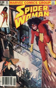
Then the mystery was why was the swan song issue so lavishly dealt with? My discount photog rates were pretty modest for back in the day but I still coughed up for rolls of film and processing! Some of the expense came from making gigantic color prints to be used as cover elements during production. Also using celestial cover painter of legend and lore, Bob Larkin to fill-in some character costumes and blend things together. A fairly difficult job as Bob was guessing where everything was!
Here’s an explanation of why this essay will be full of guesswork. The Editor of this book was Mark Gruenwald. And he had a plan… Part of that ever-evolving plan involved keeping yours truly in the dark about all manner of design elements. Generally speaking, the only person who had all the details in mind was Mark.
And he wasn’t talking.
Of course, he had to get the approval from the Top Man for the whole idea. I still have no idea why Jim said, “Yes,” and kept signing vouchers like a drunken Comic Con-goer on Sunday! He also had to get some form of approval from the lustrous, tawny beauty who would be our Spider-Woman, Executive Secretary Lynn Luckman. And have her elbow-grinding services given to us for free. Because if she had to be paid, that would involve having Marvel’s own Suddenly Dangerous Bookkeeper Millie Shuriff rouse into attack mode. No one wants that.
Then there was the rest of the “cast.” I’m not even sure there was the promise of the universal freelancer solvent: pizza.
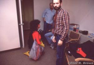
First let’s check in with Lynn. I must have been conserving film for the heart of the shoot. I only found this one “behind the scene” pic. We are upstairs in the 11th Floor Conference Room at 387 Park Ave South. Wednesday, November 3, 1982. That’s Al “Editori-Al” Milgrom in the background. Mark’s Assistant Editor Mike Carlin is barely visible and Mark looking at me!
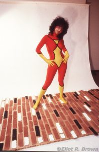
Mark had face painted most of the mask into place on patient Ms Luckman’s mug. Of particular note in this pic is the enormous wig that somehow would help Lynn resemble S-W more. It quickly was trimmed in half as it looked downright weird hanging the wrong direction on the “wall.” Next item, just visible on a chair behind Mark, is the mask that didn’t work. Finally, were these cuh-razy wing things. Now, once again, Mark depended on the good graces of the Marketing Department who provided this remarkable well-fitting costume. Spider-Woman’s wingie things proved ridiculous:
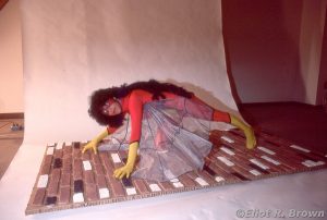
Looks good in this shot but apparently the storm warnings of needing a cover painter to fix, replace and whip up things out of whole cloth were revving up. You could just see through the mesh of the wings—no good for fixing a background.
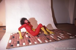
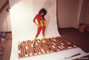
Mark and Mike had built a “brick wall” out of a ceramic brick kit for putting up phony, decorative walls (Ultimate Payback: my present-day kitchen has a flue made of cinder block—in the period of time it was installed, the very same phony brick was put on… to… make it… look… better…). At the time I noted that the spacing between the bricks was gradually changing as each course of bricks were applied. Mark told me he realized that “2 kits” of this brick stuff was not enough and that he was running out near the top third… so he cheated! (The very same flaw watches over me every morning as I make my oatmeal… )
Sharp eyed observers will note that all of this, the bricks and Lynn, were on what appears to be a super-thick piece of cardboard. Which is exactly what it is. Renowned art supply store, Charrette—supplier to architects everywhere back then—was located a few blocks north on Park Ave! It was a modeling specialty—some of those architectural models were really big – 1” thick cardboard, sold in 4×8 foot sheets! I believe it was myself who made the trip, stoically carrying that sheet on that chilly, windy avenue. Well, I was younger then.
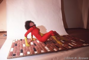
Hmm… we’re getting a little informal here–
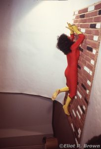
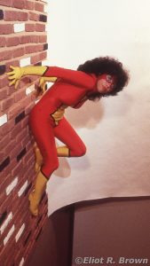
–now we’re talking! That’s a super-heroine pose off a building for sure. Mark was doing all the directing here. So blame him.
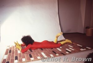
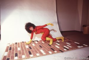
This is my favorite out-take! Spider-Woman has just roughed up someone and needs to adjust her gloves.
And, yes, I thought so much of this pic I flopped it and set it up as a vertical wall shot. Much as was done for the cover. Legendary, hard-working Cover Production Artist Ron Zalme, put in some overtime assembling the cover parts. He specced the photo blow-ups, did the trimming and pasting together. There were no less than four pictures on that cover. Not just Lynn on a wall, but the NYC courtyard shot of all the bad guys, one flying shot of Gypsy Moth and the corner box image!
Of interest, above, is that written on the cardboard slide frame in Mark’s handwriting: Too Mean.
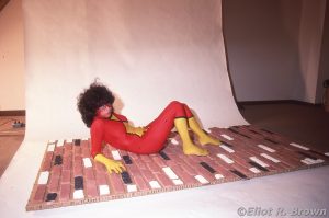
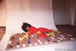
I think I captured Lynn getting a little tired and a little goofy!
This, to me, was the best version of “reality” for the whole set-up. But that’s just me; I know Mark had some other scheme. Plus it’s a really nice shot of Lynn looking confident and super-heroic while on the side of a building.
And now she went a little too far! Nice kitty-cat pout, Lynn! But also a great up-the-wall pose.
Then, believe it or not, we were done! A short 2 hours and boom! All that’s left is to shoot the corner box picture. And I’m pretty sure the above is the image used for the corner box. A quick comparison with the cover reveals Bob must’ve brought out the very fine brushes for this one! He added the mask but also the hair!
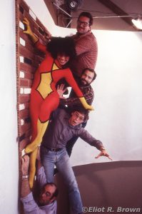
Finally, some high hilarity:
You kids with your selfies, holding up a phone that weighs 7 ounces… well, my camera had a self-timer. I may have had a whole 10-seconds to trip the shutter and throw myself on the floor. Then remember to look at the camera! Of note is, this is the single shot of this effort. I really should have tried a couple in case someone’s eyes were closed.
Featuring: Lovely Lynn who good-naturedly put up with all of this—to the rear, top: Brian Postman, Spider-Woman series penciler, Editor Mark Gruenwald, Assistant Editor Mike Carlin and hanging by his fingertips, Photographer Eliot Brown.
End Part 1
More effort was put into that shoot than the entire 70s Spider-Man live-action series.